🏫 THE BACKGROUND
A compliance score that reflected every partner differently.
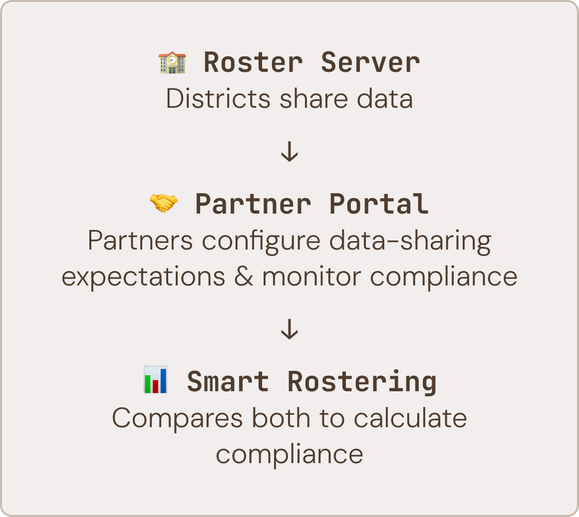
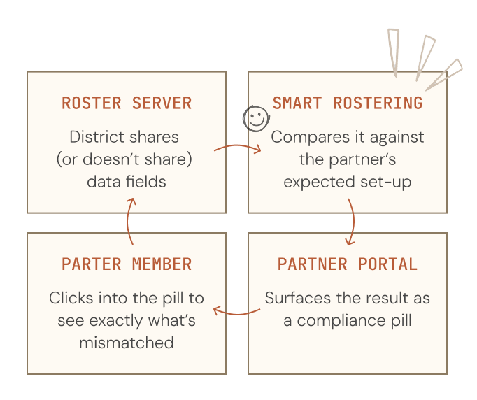
Partner Portal and Roster Server are two ClassLink products that work together. School districts manage and share their rostering data through Roster Server, while partners use Partner Portal to configure what data they expect to receive.
Partners are vendor companies like BrainPOP and Learning A-Z that integrate with districts and define what student data they require, support, or reject in each connection.
Partners are vendor companies like BrainPOP and Learning A-Z that integrate with districts and define what student data they require, support, or reject in each connection.
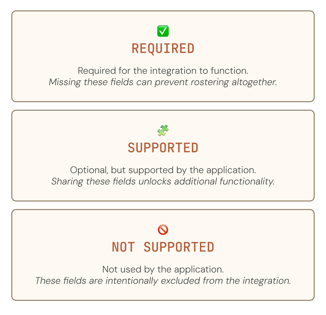
For each data field, partners choose whether it's Required, Supported, or Not Supported based on how their application works.
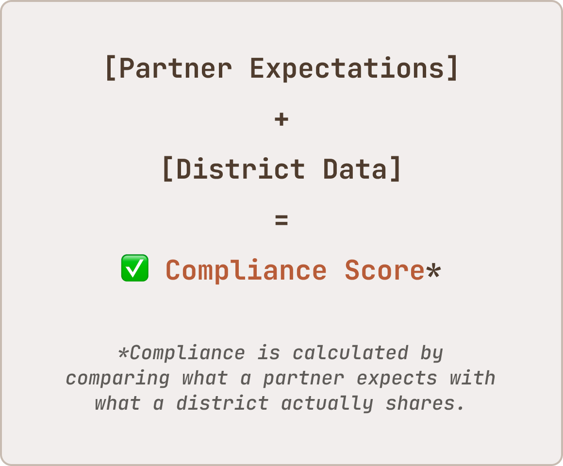
A district's compliance score reflects how closely the data shared through Roster Server matches those expectations. This means the same district can look different depending on which partner is viewing it.
A district's compliance score reflects how closely the data shared through Roster Server matches those expectations. This means the same district can look different depending on which partner is viewing it.
As more districts connected, checking that compliance became increasingly manual. I designed Smart Rostering to surface those comparisons directly in Partner Portal, giving partners a quick way to scan hundreds of connections and drill into exactly what needed attention.
🔎 THE PROBLEM
Hundreds of districts. No way to tell which ones were fine.
Before this work, there was no way to understand whether a district’s data actually met a partner’s expectations without manually inspecting each field, one at a time and across every district connection.
Even though partners defined what “good data” meant (through Required, Supported, and Not Supported fields) at the field level, there was no aggregated view of how those expectations were being met.
As a result, understanding a single connection meant drilling through raw data previews, field by field. Basically, compliance wasn’t measured and partners had to manually:
Even though partners defined what “good data” meant (through Required, Supported, and Not Supported fields) at the field level, there was no aggregated view of how those expectations were being met.
As a result, understanding a single connection meant drilling through raw data previews, field by field. Basically, compliance wasn’t measured and partners had to manually:
BEFORE: WHAT CHECKING ONE FIELD ACTUALLY TOOK →
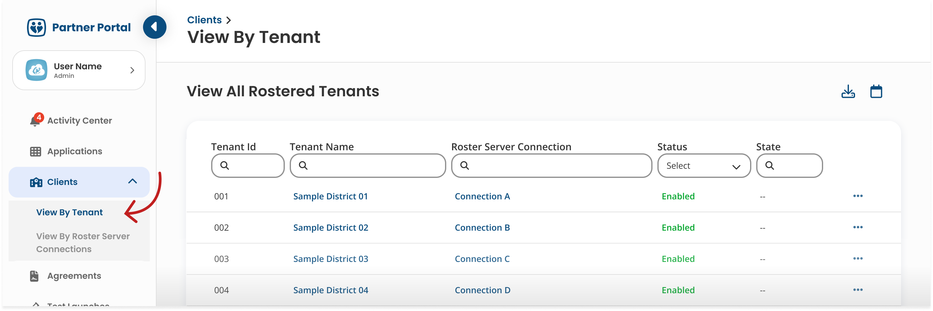
STEP 1
Navigate to tenant table.
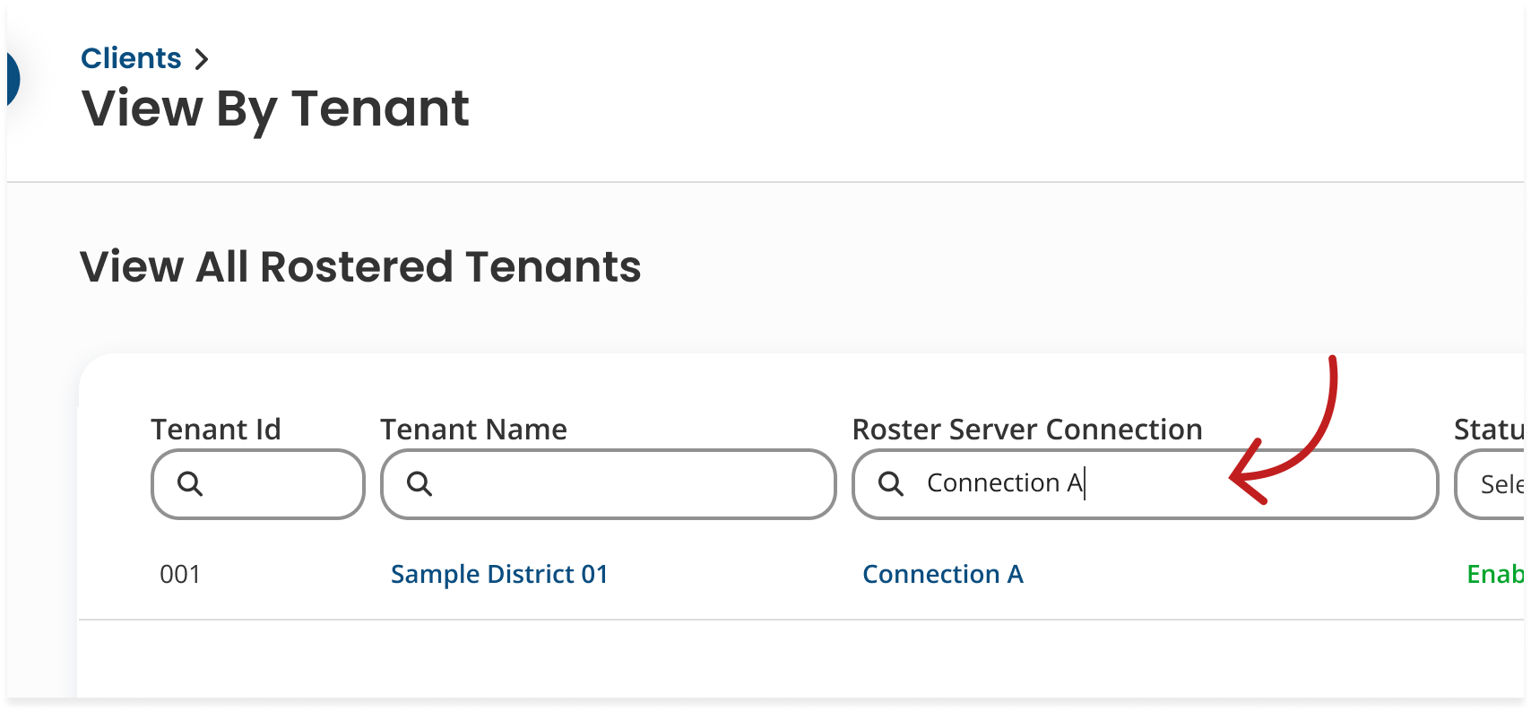
Open Partner Portal, find the Clients page. Go to View by Tenant (District) sub-page.
STEP 2
Find the Roster Server connection or district name.
Manually scan or search for the specific district you want to check.
STEP 3
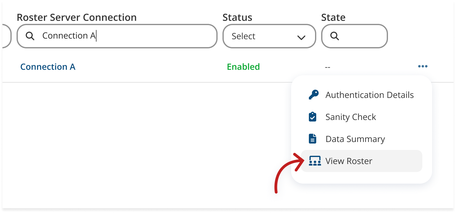
Click on "View Roster."
This opens the raw data preview for that tenant, for all fields and for all rostered collections.
STEP 4
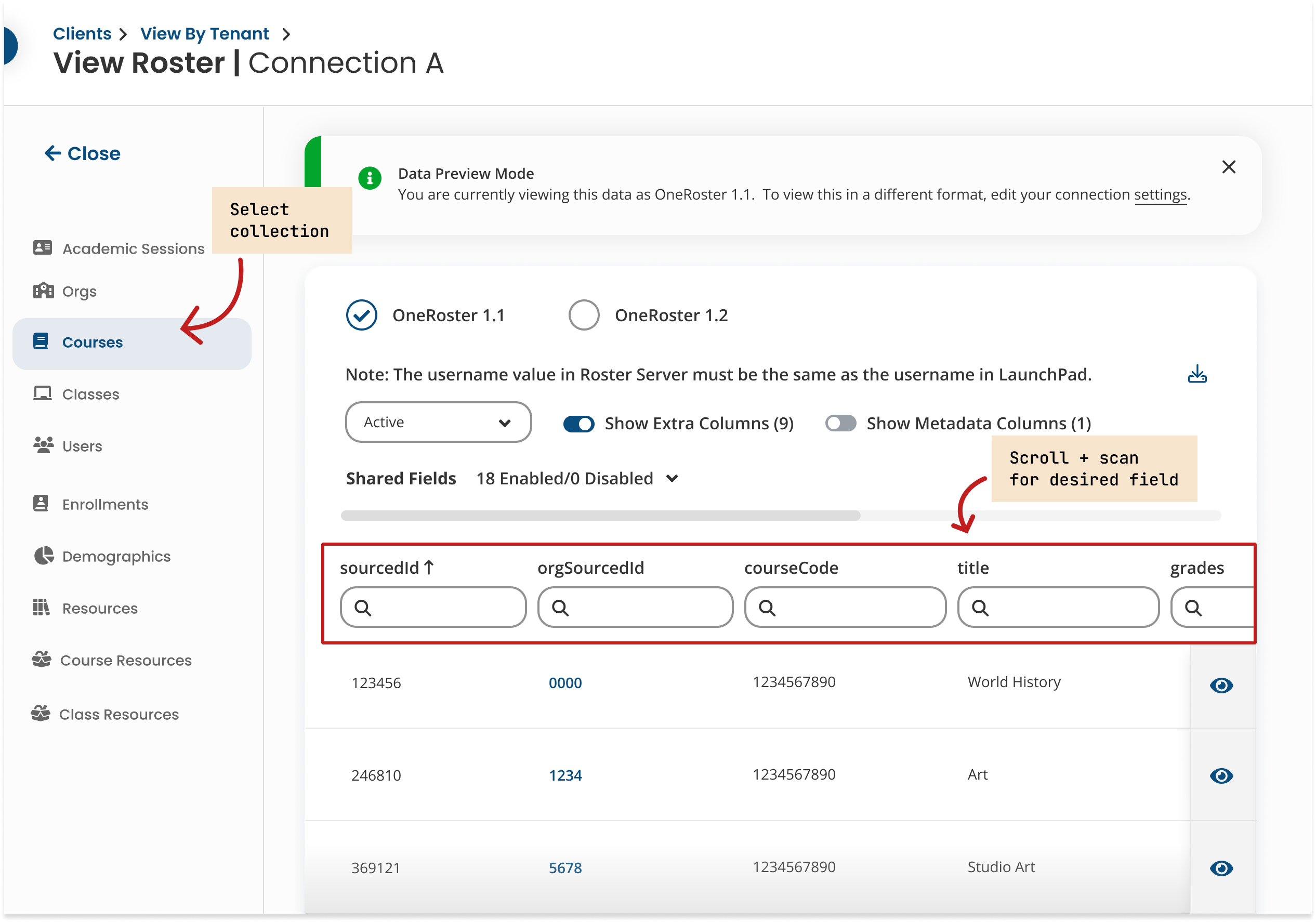
Navigate to the right collection.
Click into Courses, Orgs, Users, etc. and scan the column headers that appear for the field you want to see.
STEP 5
Notice what's missing.
If a district opted out of sharing a field, that column simply doesn't exist.
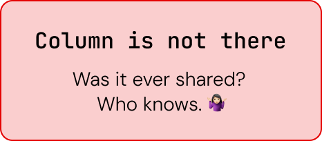
If the field was shared, data appeared. If not, nothing surfaced... no warning, explanation, or signal. This process was repeated across fields, across collections and across every district in the system.
With no summary layer, there was no way to understand compliance at a glance. It had to be done through an accumulation of repeated manual checks.
With no summary layer, there was no way to understand compliance at a glance. It had to be done through an accumulation of repeated manual checks.
AFTER: WHAT THAT CHECK LOOKS LIKE NOW
The idea made sense from the start... but the challenge was scale.
A single partner could be connected to hundreds of districts, sometimes well over 600, and there was no quick way to tell which ones actually needed attention. Every connection looked the same, whether it was healthy or unknowingly missing critical data.
A single partner could be connected to hundreds of districts, sometimes well over 600, and there was no quick way to tell which ones actually needed attention. Every connection looked the same, whether it was healthy or unknowingly missing critical data.
🚦 THE COMPLIANCE PILL
A colour does the first pass of the work.
Each district in the table is assigned a compliance percentage, visualized as a simple color pill: red (0–20%), amber (20–60%), and green (60–100%).
<20%
20-60%
>60%
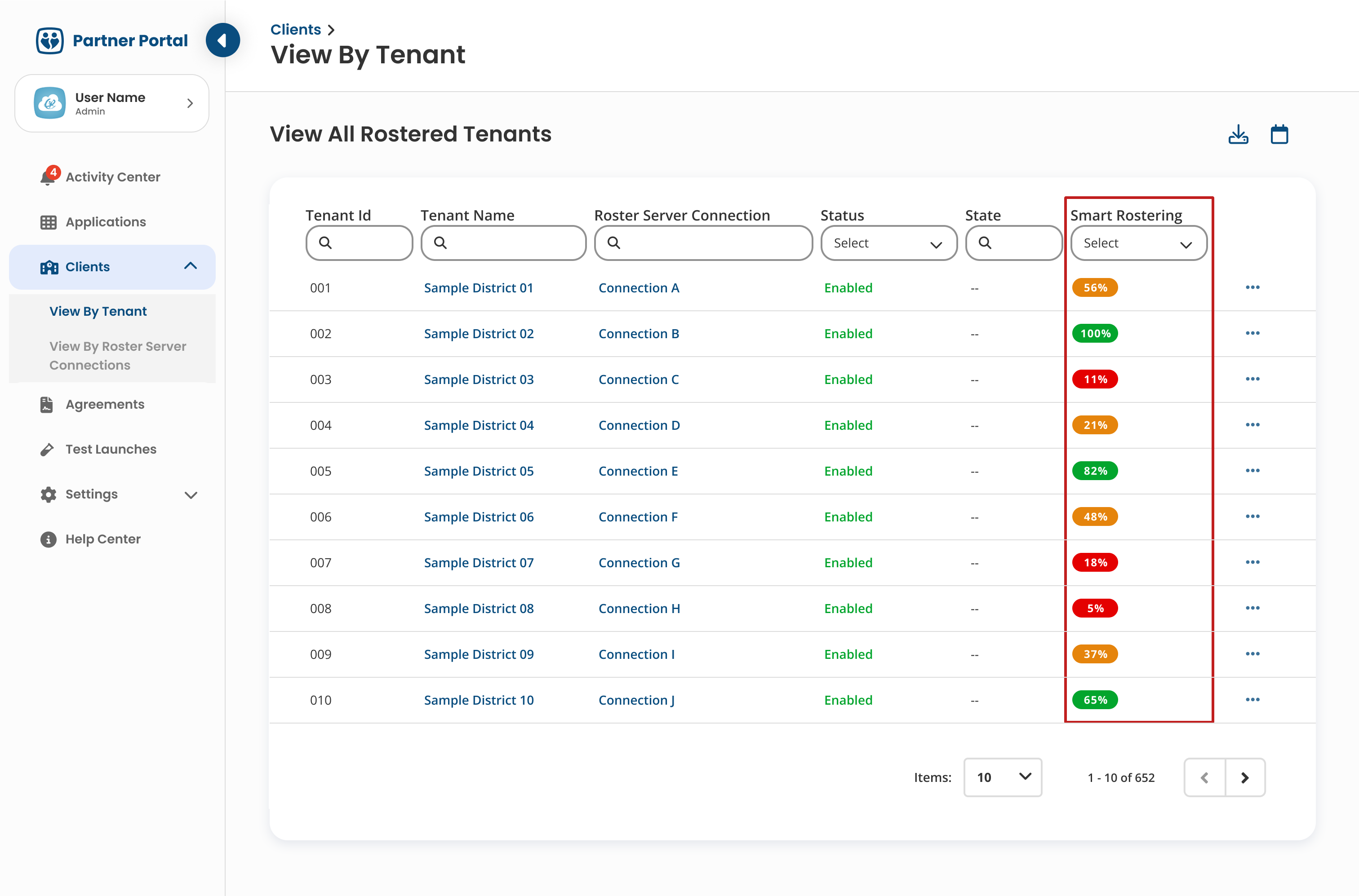
The pill also becomes a filter, allowing partners to collapse an extensive 100+ row table into only the districts that fall below acceptable thresholds.
What used to be a full scan across every connection and every rostered collection becomes a focused look at only the ones that need a closer look.
What used to be a full scan across every connection and every rostered collection becomes a focused look at only the ones that need a closer look.
Instead of reading row by row, partners can scan hundreds of districts and immediately understand where attention is needed - kind of like how a stoplight tells you what to do before you ever think about it.
🧩 THE DRILL-DOWN
A number alone was never going to be enough.
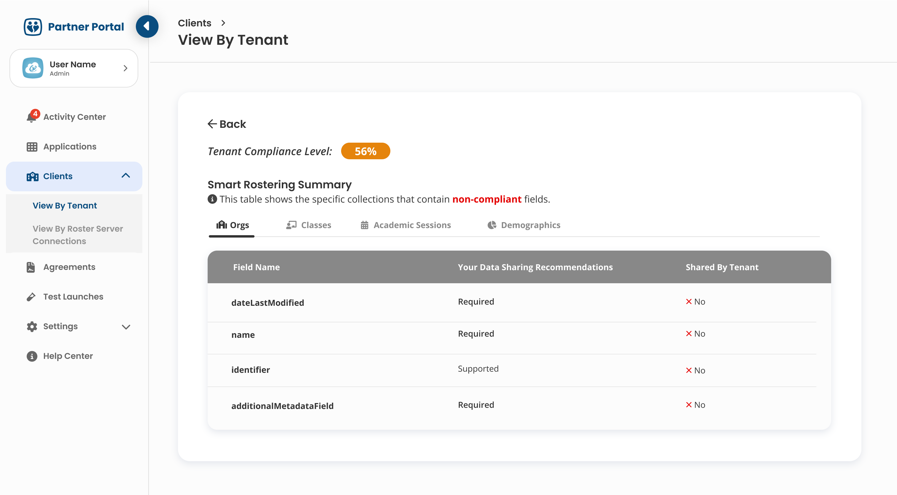
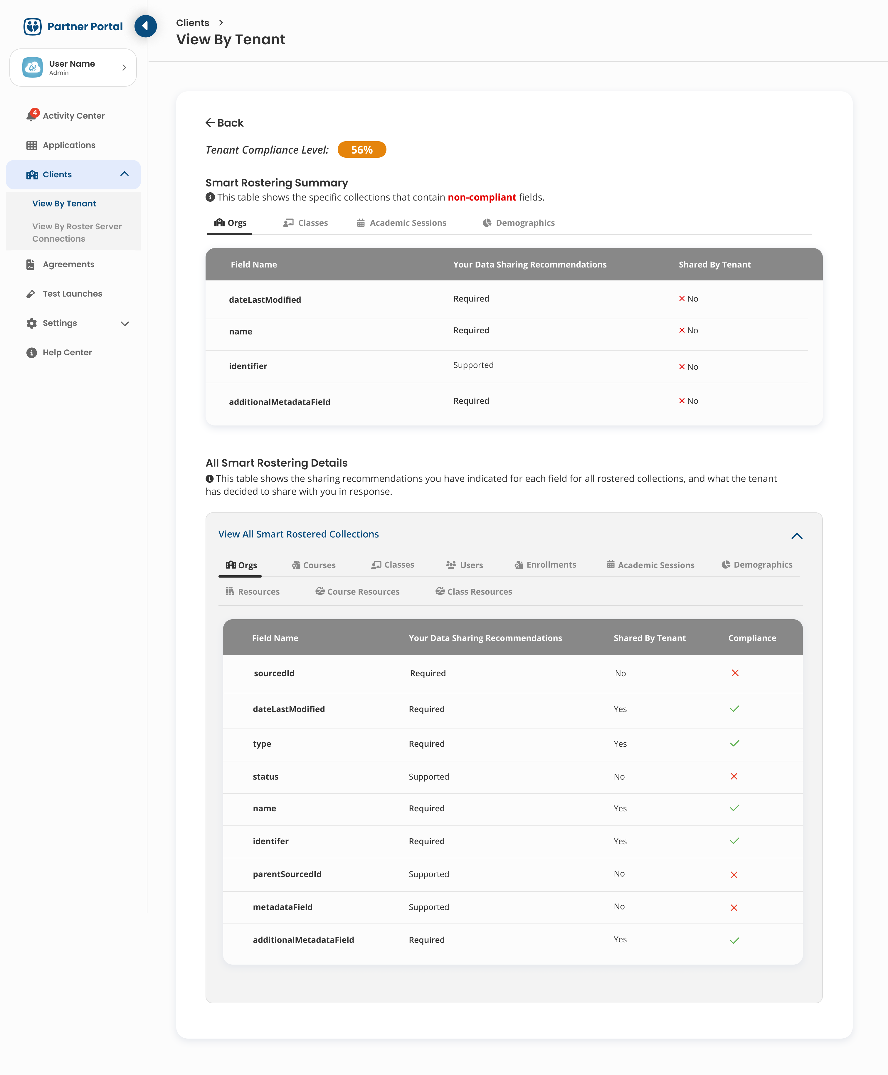
Clicking a pill opens a summary built specifically for that district: which fields are required, what the partner expects to see, and what the district actually shared back in response.
The goal was turning "you're at 56% compliant" from a slightly worrying number into something a partner could genuinely act on the same day.
The goal was turning "you're at 56% compliant" from a slightly worrying number into something a partner could genuinely act on the same day.
⚖️ THE DECISION
Show everything, or just what's broken?
This ended up being the real design question and it wasn't an obvious one.
A full table showing every field would give partners the complete picture, but most of those fields would already be matching what the partner asked for, which means a lot of scrolling past things that didn't need attention.
Showing only the fields that fell short of what the partner marked Required or Supported would be faster to scan, but it would also hide the bigger context of how compliant a district actually was overall.
A full table showing every field would give partners the complete picture, but most of those fields would already be matching what the partner asked for, which means a lot of scrolling past things that didn't need attention.
Showing only the fields that fell short of what the partner marked Required or Supported would be faster to scan, but it would also hide the bigger context of how compliant a district actually was overall.
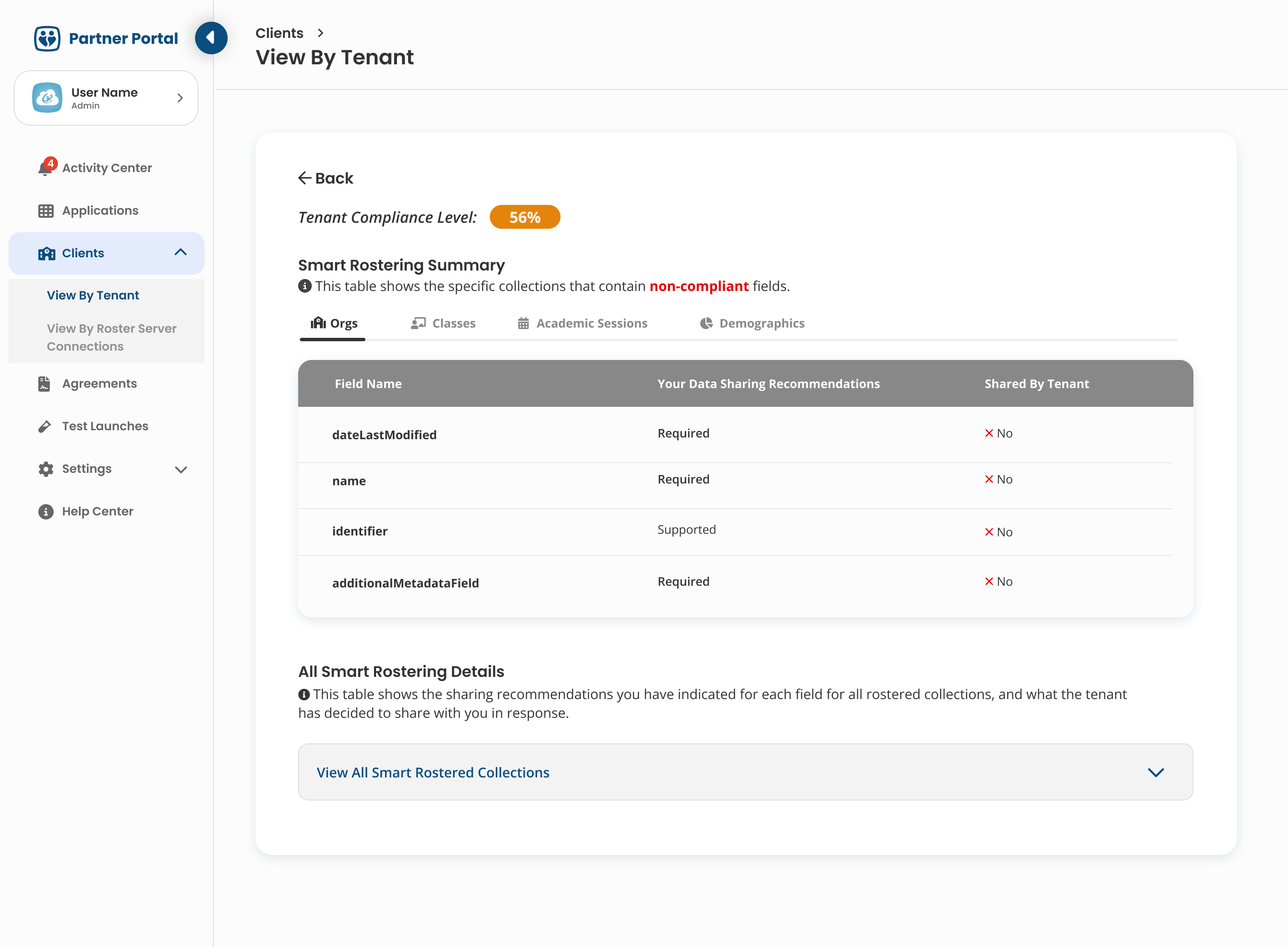
We shipped with violations-only first. It matched what partners actually needed in the moment. A short, fast list of exactly what to fix, rather than a full audit they'd have to filter through themselves.
🔁 THE ITERATION
Then it became clear the bigger picture was needed.
Once it shipped, it became clear that some partners wanted to audit every single field, not just the broken ones, especially when they were trying to understand why a tenant was sitting at 56% instead of higher. That's a fair thing to want and it wasn't something the violations-only view could answer on its own.
So we added a second table underneath the violations summary, collapsed by default, that showed the complete field-by-field breakdown.
Partners who just needed to know what to fix could ignore it entirely, and partners who wanted the full picture could expand it and dig in.
So we added a second table underneath the violations summary, collapsed by default, that showed the complete field-by-field breakdown.
Partners who just needed to know what to fix could ignore it entirely, and partners who wanted the full picture could expand it and dig in.
SHIPPED FIRST
Violations-only
Fast, action-oriented, fewer rows to scan.
→
↓
ADDED LATER
Collapsed full-detail table
Complete field breakdown, collapsed by default and expandable on demand.
Neither version was wrong on its own, the first shipped fast and solved the most common need well.
And the second extended it once real usage showed there was a second need without requiring us to undo anything we'd already built.
And the second extended it once real usage showed there was a second need without requiring us to undo anything we'd already built.
📈 THE IMPACT
A five-step manual check became one glance at a pill.
Before Smart Rostering, confirming whether a single field was shared meant five separate steps: find the connection, open the raw data preview, navigate to the right collection, scan the column headers for what was there, and try to notice what was missing.
If a district had opted out of sharing a field, its column simply didn't appear in the table with no warning flag at all.
Multiply that by every field a partner cared about, across every tenant they were connected to, and it's clear why nobody was actually doing this audit regularly. It wasn't just a slow process, but also an impractical one.
Smart Rostering collapsed all five of those steps into a single colored pill sitting right in the tenant table.
The compliance percentage didn't just summarize the old manual check faster, it replaced a process that was effectively too tedious to use at scale with one a partner could actually run on hundreds of their connections without thinking twice.
If a district had opted out of sharing a field, its column simply didn't appear in the table with no warning flag at all.
Multiply that by every field a partner cared about, across every tenant they were connected to, and it's clear why nobody was actually doing this audit regularly. It wasn't just a slow process, but also an impractical one.
Smart Rostering collapsed all five of those steps into a single colored pill sitting right in the tenant table.
The compliance percentage didn't just summarize the old manual check faster, it replaced a process that was effectively too tedious to use at scale with one a partner could actually run on hundreds of their connections without thinking twice.
LESSON 01
A colour can do a lot of the work before any text does.
Partners scanning hundreds of rows never needed to read every number. The colour told them where to look first at a glance.
LESSON 02
Default to action, not completeness.
Violations-only got partners to the actual fix faster. Full completeness could wait for the people who genuinely wanted it.
LESSON 03
A reasonable first answer beats waiting for the perfect one.
We didn't have to solve for every use case on day one. The details table came later, once real usage actually showed it was needed.
LESSON 04
A percentage means nothing without a way to act on it.
"56% compliant" only becomes useful the moment you know exactly which fields are the problem and what to do next.
The hardest part was never the math behind the percentage, it was deciding how much of it a partner actually needed to see at once.
Thank you for reading!
Thank you for reading!